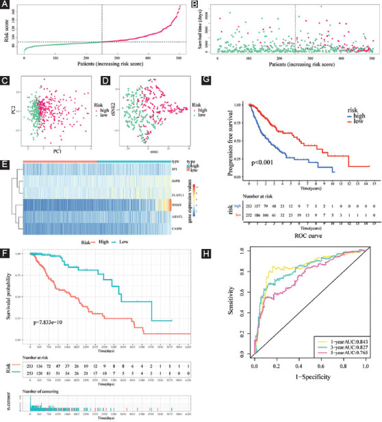
FIGURE 7.

Evaluation of the prognostic value of risk score in the training cohort. (A and B) Distribution of risk score and patient survival time and status of LGG patients (A: the green and pink dots represent the low- and high-risk samples respectively; B: the green and pink dots represent the alive and dead samples respectively) ; (C and D) PCA and t-SNE analysis illustrated an excellent clustering performance of the six-gene-based risk score; (E) heatmap of the expression levels of six FERGs involved in the signature in the cohort; and (F and G) survival curve of training cohort; (H) ROC curves of training cohort.
