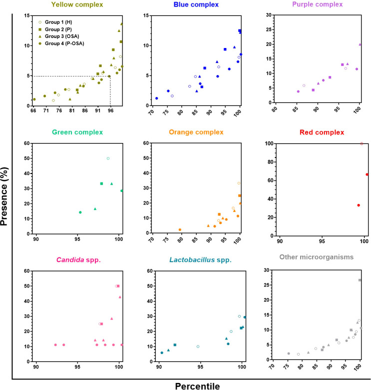
Figure 4.

Percentile graph of the percentage of presence of complexes/categories in each of the groups of participants evaluated. Each point represents the presence (%) of the complex/category in a patient. The x-axis represents the percentiles, the y-axis the presence (%) of the complexes/categories, and the dotted line in the first panel indicates that 95% of the participants in Group 4 (P-OSA) have less than 5% presence of the yellow complex, on the other hand, 5% of the subjects of this same group exhibit > 5% presence of the yellow complex.
