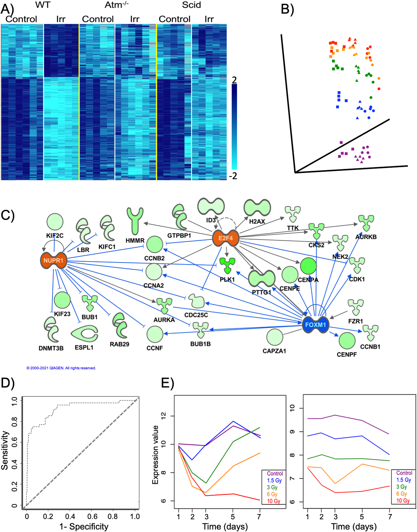
Figure 2.

Examples of analysis and visualization tools applied to transcriptomic data.
A) heatmap visualizing K-means clustering of gene expression levels produced using BRB-Array Tools (Simon et al. 2007). Each row represents a gene and each column an individual sample (mouse). Samples are arranged as indicated at the top of the heatmap. WT = wild type; Atm−/− = Atm null; Scid = Prkdcscid; Irr = 24 h post irradiation with an LD50/30 137Cs γ-ray dose. The data are from Rudqvist et al. 2018. The intensity of microarray hybridization, corresponding to the level of gene expression, is represented by the shade of blue as indicated in the key.
B) Multi-dimensional scaling plot created in BRB Array-Tools representing a 72-gene signature of radiation dose (Paul and Amundson 2008) measured in ex vivo irradiated human blood samples at 6 h (squares), 24 h (triangles), or 48 h (circles) after exposure to 0 Gy (purple), 0.5 Gy (blue), 2 Gy (green), 5 Gy (yellow), or 8 Gy (red) 137Cs γ-rays. Data from Paul et al. 2013.
C) Network generated in IPA (Krämer et al. 2014) following upstream regulator analysis of data from Figure 2 of Amundson et al. 2008. Transcription factors colored orange were predicted to be activated by radiation, and blue indicates a transcription factor predicted to be inhibited by radiation. Blue lines indicate the regulatory relationships supporting the prediction. Nodes corresponding to the down-regulated genes (green) have been colored to show the relative radiation response in HL60 cells, with darker color corresponding to a greater magnitude of decrease.
D) ROC curve summarizing performance of a diagonal linear discriminant analysis algorithm built using 20 genes in BRB Array-Tools. Mouse blood was sampled at 1, 2 or 3 days after exposure to doses from 0–10 Gy, and the samples were classified as coming from animals experiencing a survivable exposure (0–6 Gy) or a lethal exposure (10 Gy). The AUC (area under the curve) was 0.92, and the data are from Paul et al. 2019.
E) Two distinct down-regulated gene expression patterns from time-course analysis using MaSigPro (Conesa et al. 2006). Mice were exposed to 0–10 Gy γ-rays and sacrificed for gene expression measurement in blood 1–7 days later (Paul et al. 2019). Relative median expression of all genes in the pattern is plotted as a function of time, with a separate curve for each dose (color coded according to the key). The graph on the left represents 1700 genes, that on the right 98.
