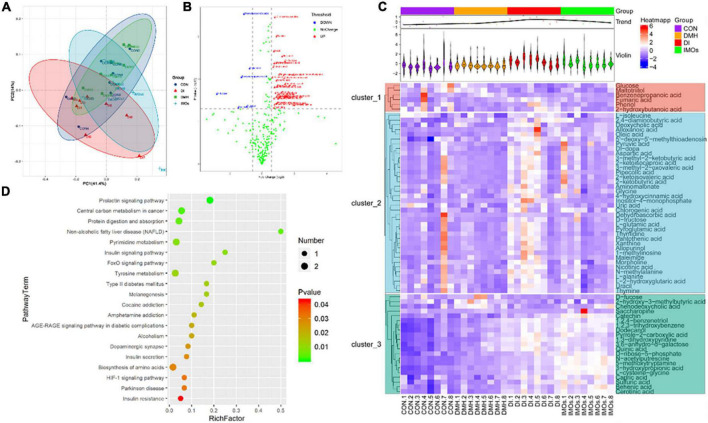
FIGURE 5.
Faecal metabolic profiling of the CON, DMH, DI and IMOs groups. (A) Scatter plot of PCoA scores for different groups. (B) Volcano plots present differential variables between the DMH and DI groups. Each metabolite is represented by a dot, where the red dots indicate up-regulation, the blue dots indicate down-regulation, and the green dots indicate no statistically significant difference. (C) Heatmap of 65 differentially abundant metabolites at normalized levels (p < 0.05) among the four groups. The dendrogram shows the distances of the metabolites based on their relative abundances. The normalized abundance values are depicted visually from red to blue, representing the highest and lowest abundances, respectively. (D) Enriched KEGG pathways in the DMH group compared with the DI group. The statistical significance values (p < 0.05) are depicted visually from red to green, representing the most and least differences, respectively. The dot sizes on the vertical axis represent the metabolite counts in the metabolic pathways.

