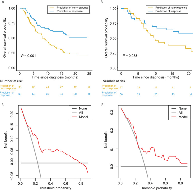
Figure 6.
Clinical Usefulness of the Nomogram. (A, B) Kaplan-Meier survival curves of patients categorized into response and non-response groups in the training set (A) and validation set (B), respectively. (C, D) DCA of the nomogram in the training set (A) and validation set (B), respectively. The x-axis represents the threshold probability. The y-axis measures the net benefit. The black line depicts the net benefit of the strategy of treating no patients. The gray line depicts the net benefit of the strategy of treating all patients. The red line represents the nomogram. The net benefit was calculated by subtracting the proportion of all patients who are false positive from the proportion who are true positive, weighting by the relative harm of forgoing treatment compared with the negative consequences of unnecessary treatment. The threshold probability is where the expected benefit of treatment is equal to the expected benefit of avoiding treatment.

