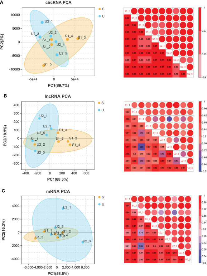
Figure 1.
circRNA (A), lncRNA (B), and mRNA (C). Left: PCA map of samples based on expression abundance. X, Y, and Z axes represent PC1, 2, and 3 respectively. Dots of different colors represent samples of different groups (S represents the stable group and U represents the unstable group); Right: heatmap of correlation between two samples based on expression abundance. The change of color from cold color to hot color indicates the relationship of the correlation coefficient between samples from small to large, the horizontal and vertical axes represent the name of samples, and the numbers in each grid represent the value of correlation coefficient.

