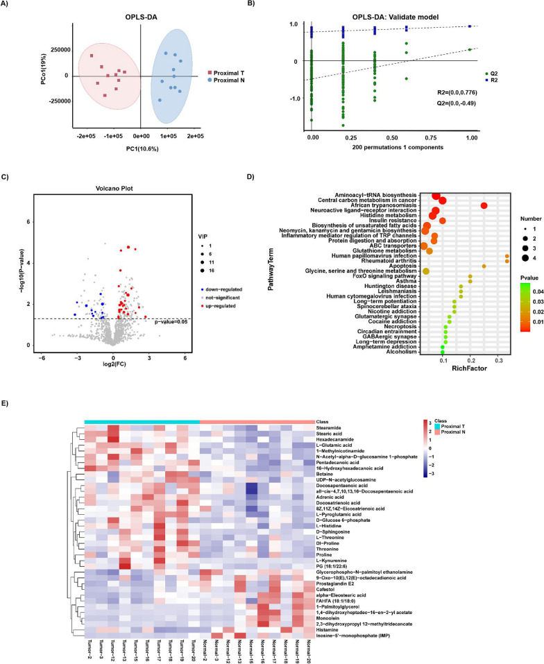
Fig. 5.
Metabolite composition and difference between Proximal T and Proximal N. A, B OPLS-DA showed that Proximal T and Proximal N were separated into two clusters. Test for OPLS-DA model showed that the OPLS-DA model for this study was valid. C Volcano map of different metabolites between Proximal T and Proximal N. (VIP > 1 and p value < 0.05). D The functions of these metabolites and metabolic pathways were studied using the KEGG database. E Heatmap representative differentially metabolites between Proximal T and Proximal N. Tumor, represents the samples of Proximal T; Normal, represents the samples of Proximal N.The abscissa represents the sample name and the ordinate represents the differential metabolite. The color from blue to red indicates that the expression abundance of metabolites is from low to high, that is, the more red indicates that the expression abundance of differential metabolites is higher

