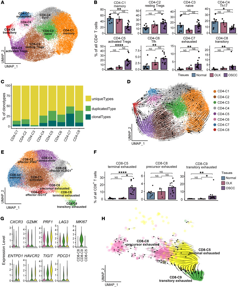
Figure 2. T cell dysfunction and cell state transitions in OSCC.
(A) UMAP plot showing the distribution of CD4+ T cell subsets. Each color represents a CD4+ T cell subset. (B) Bar plots showing the percentage of CD4+ T cell subsets among total CD4+ T cells in adjacent normal, OLK, and OSCC tissues. Each color represents a tissue type. (C) Bar plots showing the percentages of TCR-expanded clonotypes in the CD4+ T cell subsets. The colors indicate different expanded clonotypes. (D) The RNA velocity of CD4+ T cells was visualized on the UMAP plot based on the stochastic model in the scVelo algorithm, suggesting a putative differentiation direction for CD4+ T cells. The arrows indicate the putative differentiation direction. (E) UMAP plot showing the distribution of CD8+ T cell subsets. Each color represents a CD8+ T cell subset. (F) Bar plots showing the percentages of 3 subsets of CD8+ T cells among total CD8+ T cells in adjacent normal, OLK, and OSCC tissues. (G) Violin plots showing the expression levels of effector molecules and immune-inhibitory receptors in 3 subsets of CD8+ T cells. (H) The RNA velocity of CD8+ T cell subsets was visualized on the UMAP plot based on the stochastic model in the scVelo algorithm, suggesting a putative differentiation direction for CD8+ T cell subsets. Arrows represent the putative differentiation direction. *P < 0.05, **P < 0.01, and ****P < 0.0001, by Kruskal-Wallis test followed by Bonferroni’s multiple-comparison test (B and F).

