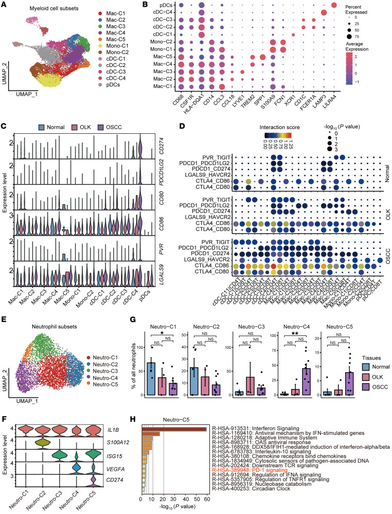
Figure 3. Subsets of myeloid cells and neutrophils that inhibit the function of T cells.
(A) UMAP plot showing the distribution of myeloid cell subsets. Each color represents a subset of myeloid cells. (B) Dot plot showing highly expressed marker genes in myeloid cell subsets. (C) Violin plot showing the expression levels of immunosuppressive ligand molecules in myeloid cell subsets in each tissue. (D) Dot plot showing the interaction intensity between myeloid cell subsets and CD4+ and CD8+ T cells according to CellPhoneDB analysis. Blue indicates low-intensity interaction and red indicates high-intensity interaction. The dot size represents –log10 (P value), and a larger dot indicates a smaller P value. (E) UMAP plot showing the distribution of neutrophil subsets. Each color represents a subset of neutrophils. (F) Violin plot showing the expression levels of specifically expressed genes in neutrophil subsets. Each color represents a gene. (G) Bar plots showing the percentages of neutrophil subsets among the total neutrophils in adjacent normal, OLK, and OSCC tissues. *P < 0.05 and **P < 0.01, by Kruskal-Wallis test followed by Bonferroni’s multiple-comparison test. (H) Bar plot showing the results of enrichment analysis of the set of genes highly expressed in Neutro-C5 in the Reactome database, with the horizontal coordinate representing –log10 (P value). Hypergeometric distribution; P < 0.01.

