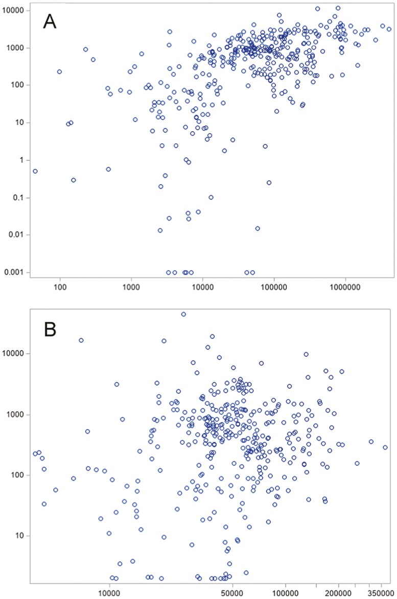
Figure 2.
Distribution of industry payments and Medicare spending for oncology drugs, 2014-2018. Medicare spending is shown on x-axis and general payments on the y-axis. Each observation represents a drug-calendar year pair; individual drugs are therefore represented multiple times across the 5-year study period. Industry payments and Medicare spending are both standardized to the number of prescribing physicians, representing the mean dollar value per prescribing physician within that calendar year. $2 were added to all y-axis values to allow for the inclusion of observations wherein the mean value of industry payments was <$1 (N = 15). Total Medicare spending vs. total industry payments (A, Pearson correlation 0.39, P < .001) and Medicare spending per prescribing physician vs. industry payments per prescribing physician (B, Pearson correlation −0.04, P = .47) are shown. All values are in nominal USD. A: Medicare spending (1000 USD) on the x-axis and industry payments (1000 USD) on the y-axis. B: Medicare spending per physician (USD) on the x axis and industry payments per physician (USD) on the y-axis.

