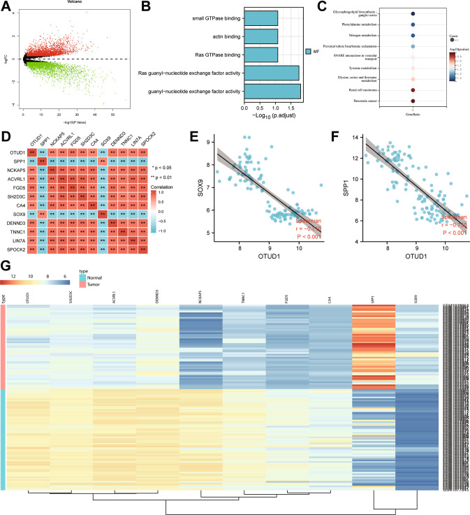
Fig. 1. Prediction of the DEGs and their molecular interactions in NSCLC.
A A volcano map of the results from differential analysis of the GSE44077 dataset. Red dots represent upregulated genes, green dots represent downregulated genes and black dots represent un-differentially expressed genes. B GO analysis of the top 50 DEGs screened from the GSE44077 dataset. C KEGG enrichment analysis of the top 50 DEGs screened from the GSE44077 dataset. D Correlation analysis heat map of the top 10 DEGs screened from the GSE44077 dataset. E Correlation analysis of OTUD1 and SOX9 in the GSE44077 dataset. F Correlation analysis of OTUD1 and SPP1 in the GSE44077 dataset. G A heat map of the expression of the top 10 differential genes in the GSE44077 dataset. The color scale from green to red indicates the expression level of genes from low to high.

