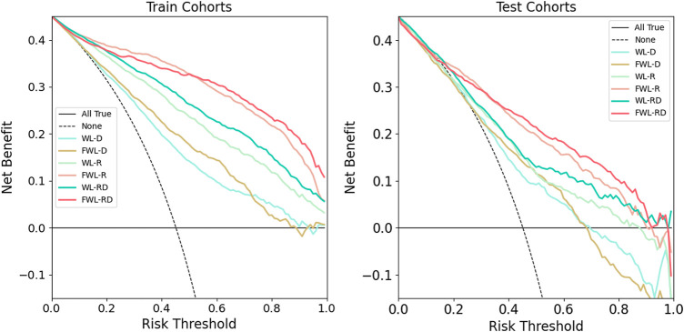
FIGURE 6.
The comparison of clinical application values using decision curve analysis. The left and right plots showed the results of training and testing cohorts, respectively. The solid cyan line, solid brown line, solid light green line, solid pink line, solid green line, and solid red line represent the results of WL-D, FWL-D, WL-R, FWL-R, WL-RD, FWL-RD sets, respectively. The horizontal solid black line denotes that all patients didn’t suffer from RP. On the contrary, the dashed black line represents a condition that all patients occurred RP.

