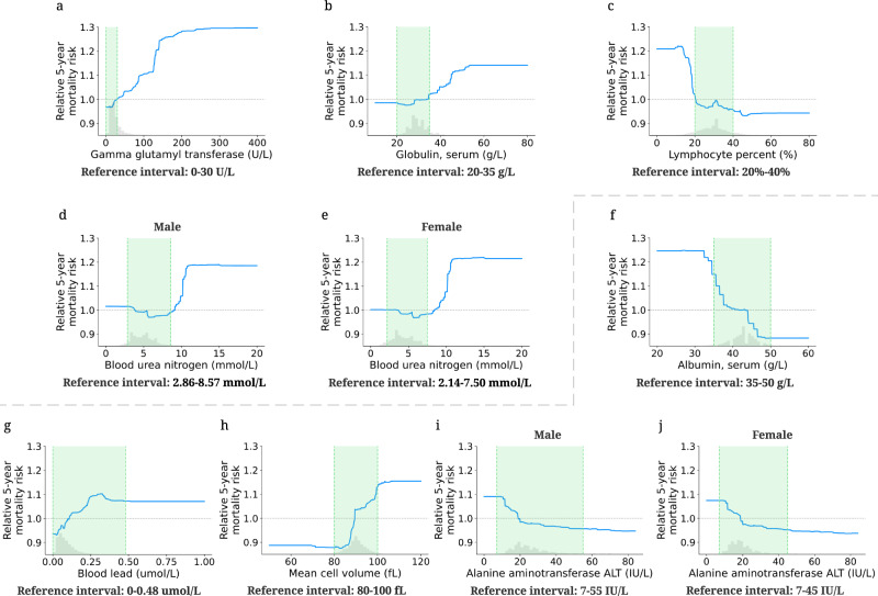
Fig. 4. Effect of varying laboratory feature values on 5-year mortality risk.
The partial dependence plots show the change in relative 5-year mortality risk for all values of a given laboratory feature. The grey histograms on each plot show the distribution of values for that feature in the test set. The green shaded region shows the reference interval of each feature. The grey dotted line shows the average value of the model predicted probability (y = 1). a–e The partial dependence plots of the features whose reference intervals are optimal for mortality risk. f–j The partial dependence plots of the features whose reference intervals are sub-optimal for mortality risk.

