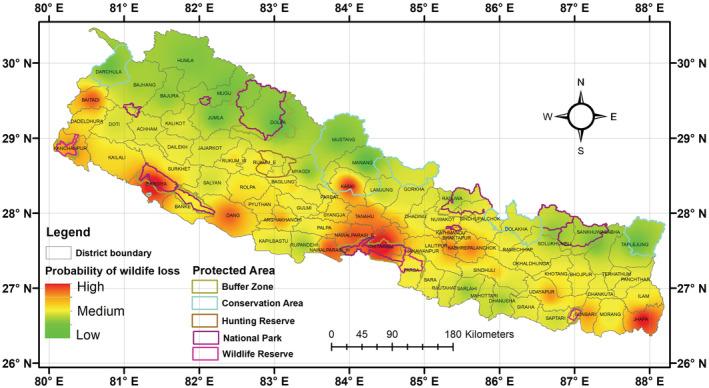
FIGURE 5.

A map depicting the likelihood of wildlife loss based on model averaged coefficients of the best fit models. Green represents a low probability of wildlife loss (0–0.40), yellow a medium probability (0.40–0.60), and red a high probability (0.60–1).
