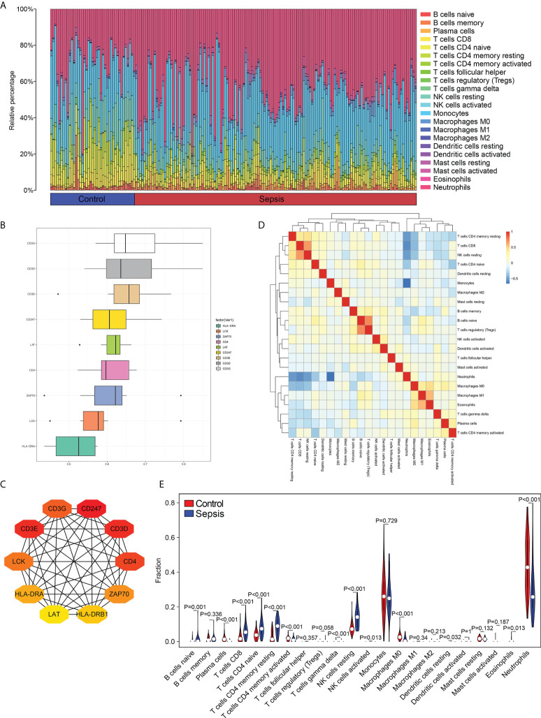
Figure 2.
Distribution of immune cell subtypes in the merged dataset. (A) Bar plot showing percentage infiltration of 22 immune cells in each sample. (B) The top 10 hub genes according to Friends analysis. (C) The PPI network shows the interactions of the top10 genes. (D) Correlation heatmap of 22 immune cell types. (E) Violin plot showing differential infiltration of the 22 immune cell populations.

