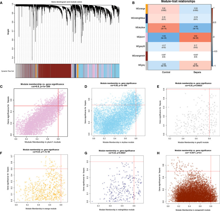
Figure 6.
Results of WGCNA. (A) Cluster analysis of the combined dataset. The different module clusters are color-coded. (B) Correlation between the different modules in the normal and sepsis groups. (C–H), Scatter diagrams for module membership vs. gene significance of sepsis. (C) The plum1 modules with the highest correlation. (D) The correlation between the skyblue module and the genes.(E) Display of the correlation between the grey60 module and the genes. (F) Display of the correlation between the orange module and the genes. (G) Display of the correlation between the midnightblue module and the genes. (H) Display of the correlation between the orangered4 module and the genes.

