. 2022 Jul 20;4(5):e210299. doi: 10.1148/ryai.210299

Figure 4:

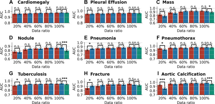
Bar plots with error bars show disease classification performance of models on the internal testing set under different ratios of training data. Blue bars represent the areas under the receiver operating characteristic curve (AUCs) with 95% CIs for CheXNet, red bars represent AUCs with 95% CIs for CheXDet, and green bars represent AUCs with 95% CIs for CheXNet trained with additional data from CheXpert dataset. Under many scenarios, CheXDet and CheXNet achieve similar performance without evidence of a difference on the internal disease classification task. Whiskers represent the 95% CIs. n.s. = not significant. * represents P < .05, *** represents P < .001.

Bar plots with error bars show disease classification performance of models on the internal testing set under different ratios of training data. Blue bars represent the areas under the receiver operating characteristic curve (AUCs) with 95% CIs for CheXNet, red bars represent AUCs with 95% CIs for CheXDet, and green bars represent AUCs with 95% CIs for CheXNet trained with additional data from CheXpert dataset. Under many scenarios, CheXDet and CheXNet achieve similar performance without evidence of a difference on the internal disease classification task. Whiskers represent the 95% CIs. n.s. = not significant. * represents P < .05, *** represents P < .001.