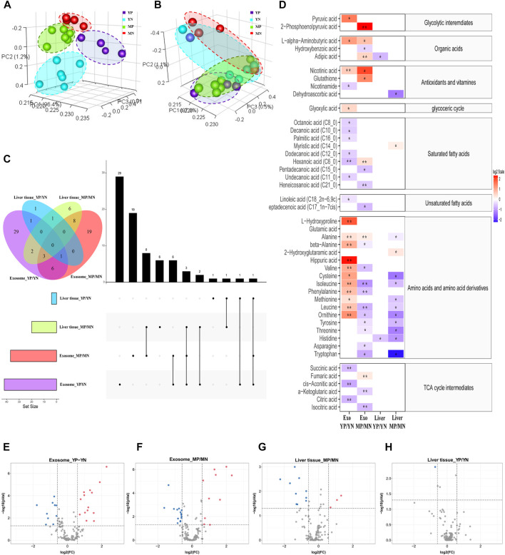
FIGURE 2.
Principal component analysis (PCA) of metabolite patterns in (A) exosomes and (B) liver tissues. (C) Upset plot and Venn diagram of differential (p < 0.05) metabolites. The individual or connected dots represent the various intersections of metabolites that were either unique to or shared among comparisons. (D) Heatmap of the metabolites detected in each group showing the ratio of metabolites levels among the groups. Red color represents higher metabolites concentrations in PCOS groups than the normal groups, while blue color indicates lower levels in PCOS groups than the normal groups. The relative concentration of metabolites was plotted using a log2 scale, the significant fatty acids with p-values less than 0.05 are labelled with single asterisk, and q-values less than 0.05 are labelled with double asterisk. (E–H) Volcano plot of the differential (p < 0.05, FC > 1.5) metabolites in different positions. Red dots indicated upregulation, and blue dots indicated downregulation.

