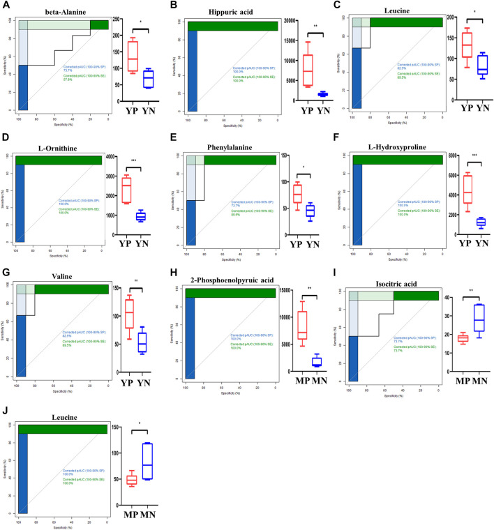
FIGURE 3.
ROC curves for exosomal metabolites (A–J) with an area under the ROC curve above 90% (left panel). The levels of shortlisted metabolites are display as boxplots (right panel). Comparisons are either between young PCOS (YP) and young normal (YN), or middle age POCS (MP) and middle age normal (MN).

