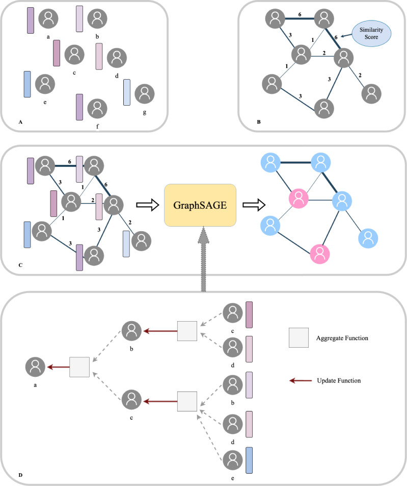
Figure 3. Population graph building and model prediction pipeline.
(A) Each patient was regarded as a node and the Transformer-generated feature was regarded as node features. (B) Graph edges and the relevant weights were defined by their similarity scores. (C) We then put the whole population graph to train the GraphSAGE network in order to make a prediction for each patient (pink indicates high risk and blue indicates low risk). (D) Node updating inside the GraphSAGE network.

