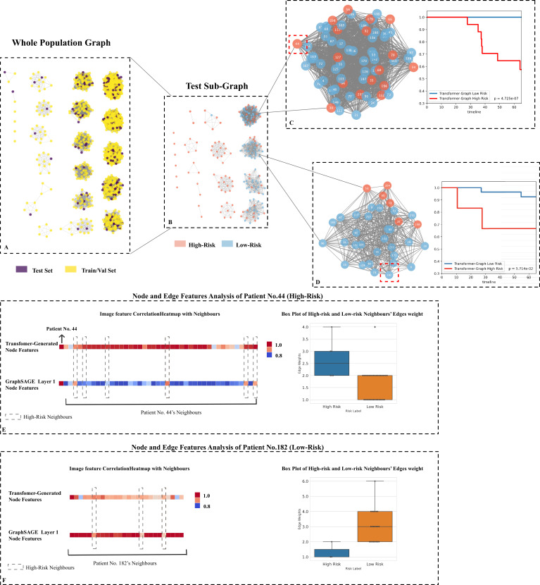
Figure 5. Testing set graph analysis.
(A) A visual representation of the whole cohort population graph of 1705 patients. (B) A visual representation of the testing sub-graph of 213 patients. (C) and (D) two sub-graphs containing challenging cases where the graphs contained both high- and low-risk patients. (E) Node features’ correlation heatmaps and edge weights distribution of patient No. 44: Each square represents a neighbour’s node features’ correlation coefficient, higher values (red colour) reveal closer relation with the target node; the box plot of 42 neighbours indicates that the high-risk neighbours (blue box) have higher edge weights median. (F) Node features’ correlation heatmaps and edge weights distribution of patient No. 182: The box plot of 25 neighbours indicates that the low-risk neighbours (orange box) have higher edge weights median.

