
Figure 3. Extensive reprogramming of the epigenomic architecture in heart disease.
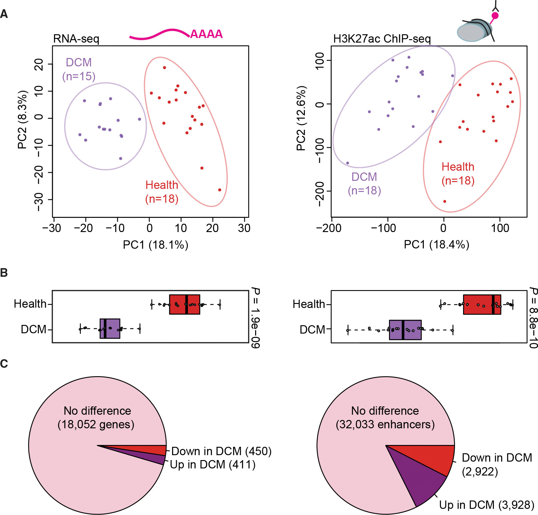
(A) Principal-component analysis showing the first two principal components (PC1 and PC2) for the top 1,000 variably expressed genes from RNA-seq (left) and for distal enhancer peaks from ChIP-seq (right). Each point indicates a unique sample, color coded by cohort.
(B) Boxplots showing PC1 for each sample by cohort (left: RNA-seq, right: ChIP-seq). Boxplots indicate median and quartile values for each data set; points indicate individual samples. PC1 separates disease state in both RNA-seq and ChIP-seq data (p values by two-sided Mann-Whitney U test).
(C) Pie charts showing the proportion of unchanged versus differentially expressed genes (left) and differentially bound enhancer peaks (right) relative to each cohort (see STAR Methods for details).