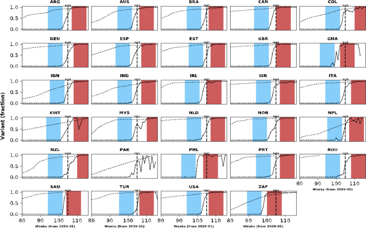
Appendix 1—figure 4. Population-level vaccination coverage.
Data from different countries are presented in different panels; x-axes show epidemiological weeks since the first epidemiological week of 2020. As in Figure 1, continuous black lines represent frequency of Omicron variant relative to the other variants. In addition to information on Omicron variant frequency, each panel also shows data on vaccination: the dashed line shows the proportion of population vaccinated with at least one dose relative to the maximum number vaccinated in each country at the time of the analysis (March 2022). Data used to generate this figure were downloaded from https://ourworldindata.org/.

