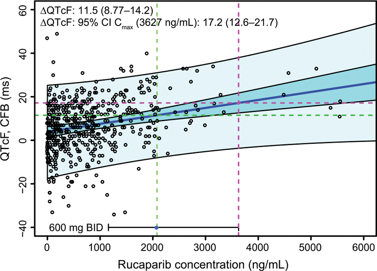
Fig. 4.

QTcF analysis based on data from Study 10 dose escalation. The points are triplicate mean ΔQTcF vs time-matched concentrations. The solid blue line is the line of best fit for mean ΔQTcF vs concentration using a linear mixed-effects model. The dark blue shaded band is the 5th to 95th percentile confidence interval in the mean fit. The light blue shaded band is the 5th to 95th percentile prediction interval of the data. The horizontal bar at the bottom of the plot is the 5th to 95th percentile range of Cmax,avg,ss data following 600 mg rucaparib BID from patients with high-grade ovarian cancer included in the exposure-safety analysis. The point is the median Cmax, and the vertical dashed green and magenta lines indicate the median and 95th percentile concentrations, respectively. The projected ΔQTcF at the median and the 95th percentile Cmax (labeled as ‘95% CI’ in the figure) are indicated by the green and magenta horizontal dashed lines, respectively. ΔQTcF, QTcF change from baseline; CFB, change from baseline; CI, confidence interval; Cmax, maximum concentration; QT, time from the start of the Q wave to the end of the T wave on an electrocardiogram; QTcF, QT corrected according to Fridericia’s formula.
