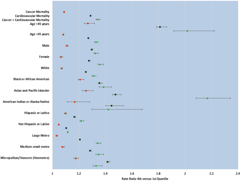
Figure 2.
Comparison of Age-Adjusted Mortality Rates (Fourth vs First SVI Quartiles)
This figure shows rate ratios for age-adjusted mortality between the fourth (most vulnerable) and first (least vulnerable) quartiles of the 2018 county-level social vulnerability index (SVI) for cancer (red squares), cardiovascular disease (blue squares), and comorbid cancer and cardiovascular disease (green squares), stratified by demographic and urbanization characteristics. Higher rate ratio values depict a greater impact of SVI.

