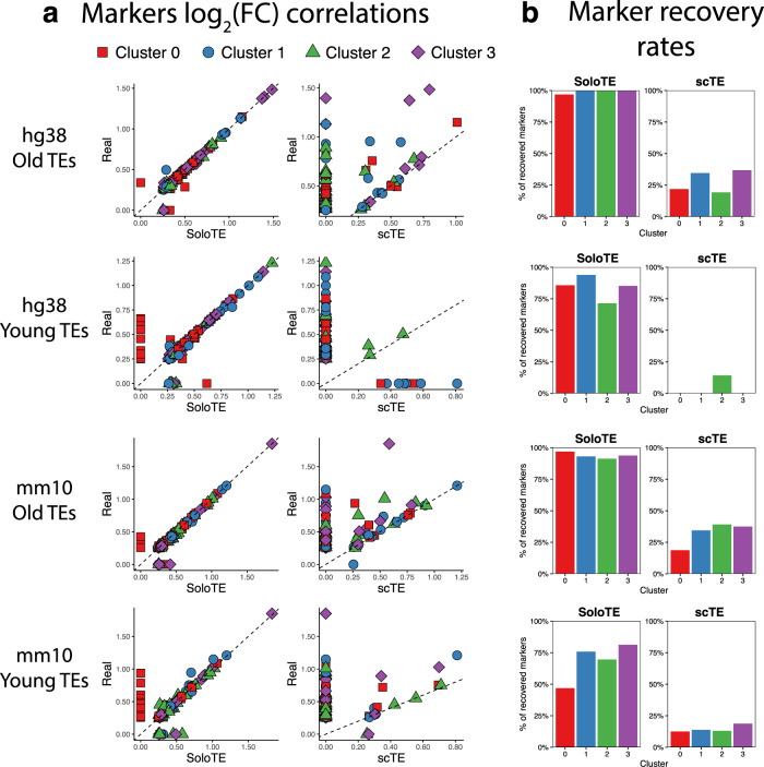
Fig. 3. Comparison of predicted cell markers between SoloTE and scTE.
a For each simulated dataset, correlation plots of the average log2(FC) are depicted, with the real value on the y axis, and the method (SoloTE or scTE) on the x axis. Cluster 0 markers are shown in red squares, Cluster 1 markers in blue circles, Cluster 2 markers in green triangles and Cluster 3 markers in purple diamonds. Dashed line at y = x was added to aid in visualization of under- and over-estimation of values. b Bar plots showing the rate of markers retrieved by each method. Cluster identifier is indicated on the x axis, whereas the percentage of correctly recovered markers on the y axis.

