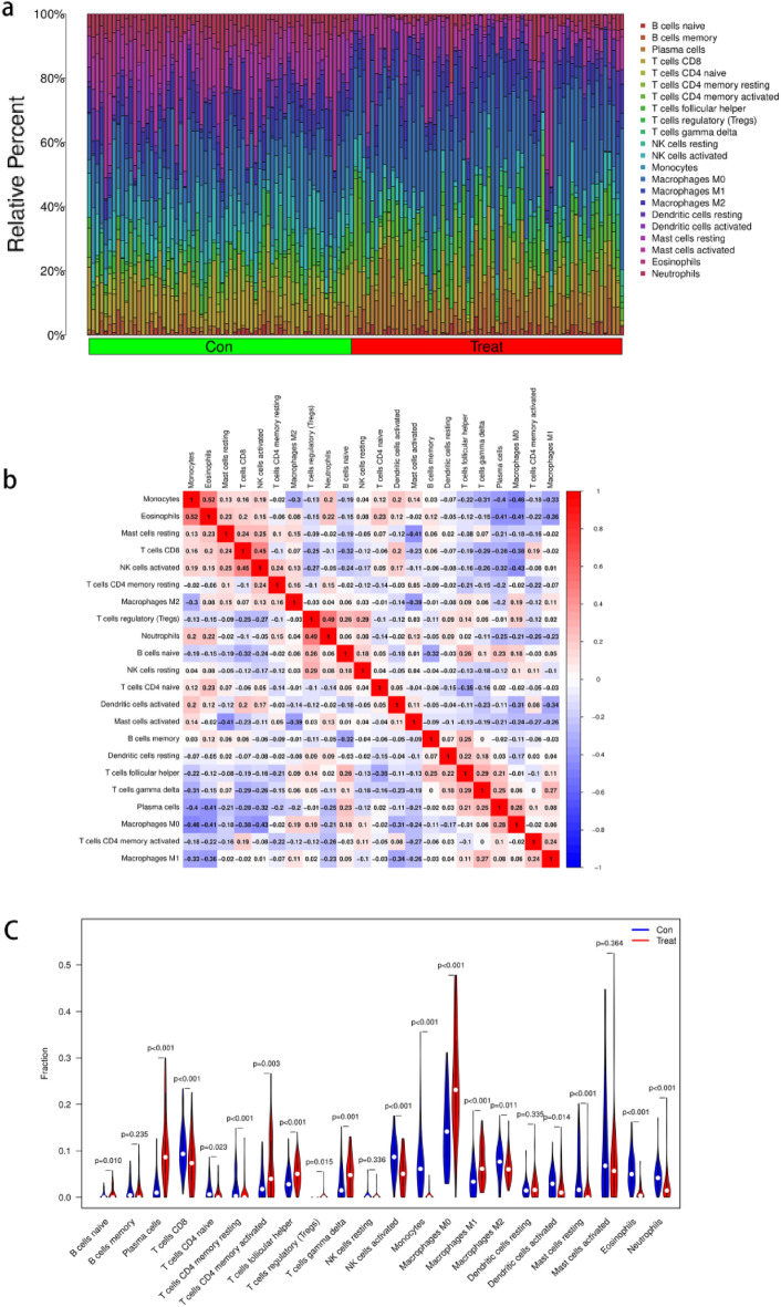
Figure 8.
Correlation analysis among immune cells and Differential analysis of immune cells. (a) The 22 immune cell populations in normal lung tissue and NSCLC. ‘con’ represents normal lung tissue, ‘treat’ represents NSCLC. The vertical coordinate represents the amount of immune cells. (b) Correlation heatmap Indicates the correlation analysis of immune cells. The redder of the point, the stronger the positive correlation, the reddest point represents the two immune cells with the most significant positive correlation. The bluer the colour of the point, the stronger the negative correlation, the two immune cells with the most significant negative correlation correspond to the bluest points. (c) The vioplot showed the difference in 22 immune cells between normal lung tissue and NSCLC. ‘con’ represents normal lung tissue, ‘treat’ represents NSCLC. P < 0.05 means difference is statistically significant.

