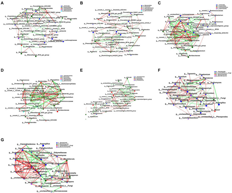
Figure 7.
Interaction network diagram of fecal microbiota in each group. (A) The network diagram of the interaction between the fecal bacterial microbiota in the NC group. (B) Interaction network diagram of fecal bacterial microbiota in the Control group. (C) Interaction network diagram of fecal bacterial microbiota in LFMT group. (D) Interaction network diagram of fecal bacterial microbiota in HFMT group. (E) Interaction network diagram of fecal bacterial microbiota in SFMT group. (F) The network diagram of the interaction between fecal fungi in the Control group. (G) Interaction network diagram of fecal mycobiota in the LFMT group. The size of the nodes in the figure represents the abundance of species, and different colors represent different species; the color of the connection line represents positive and negative correlation, red represents positive correlation, and green represents negative correlation; the thickness of the line represents the magnitude of the correlation coefficient, the line Thicker lines indicate higher correlations between species; more lines indicate closer connections between the species and other species.

