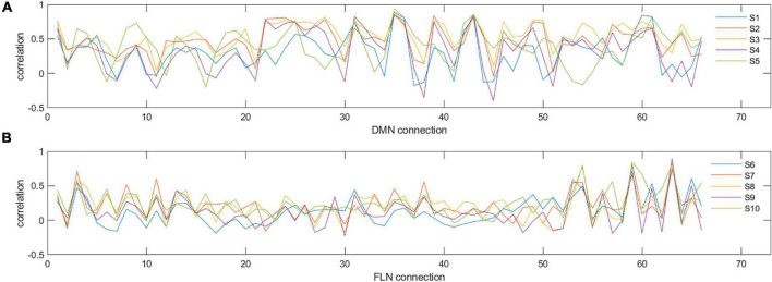
FIGURE 2.
Examples of individual connectivity ‘profiles’ in DMN (A) and FLN (B) for five selected participants (S1–S5 for DMN and S6–S10 for FLN). y-axis represents the correlation strength and x-axis represents each of the different pairwise correlations of all the nodes in that network. As can be seen, certain nodes show very consistent correlations across participants, while others show variability. For example, for the DMN, connectivity measure numbers 31, 35, and 36 are consistent across the five participants (reflecting similarity), whereas connectivity measure numbers 30, 32, 33, and 34 show high variability (reflecting dissimilarity).

