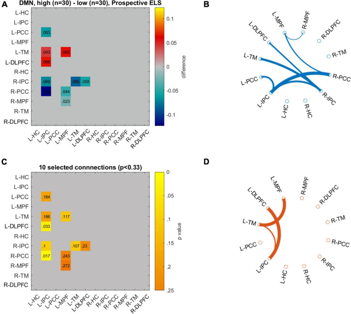
FIGURE 5.
Differences in network connectivity between participants with highest (n = 30) and lowest (n = 30) prospective ELS values are plotted as mean difference (A) and 10 connections with the lowest p-values (C). Circulographs of the negative (B; high prospective ELS → reduced connectivity) and positive (D; high prospective ELS → increased connectivity) differences.

