
Figure 3.
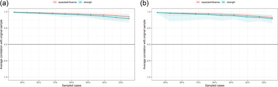
The x‐axis indicates the percentage of cases of the original sample included at each step. The y‐axis indicates the average of correlations between the centrality indices from the original network and the centrality indices from the networks that were re‐estimated after excluding increasing percentages of cases. (a) Wave 1. (b) Wave 2.