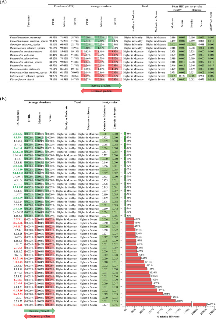
FIGURE 2.

Taxonomical and functional comparison between healthy and COVID‐19 subjects. Panel (A) reports the significantly different taxa between groups, reporting prevalence, average abundance, trend, and ANOVA and Tukey HSD post hoc p value. Panel (B) indicates the EC numbers with an increase >400% and a decrease <50% in severe COVID‐19 subjects compared to healthy samples. In detail, the panel reports the average abundance of each group, the trend, the t‐test p value, and the bar plot representing the relative percentage difference. Moreover, EC numbers highlighted in green are related to the metabolism of complex carbohydrates, while EC numbers highlighted in red are related to the protein metabolism.
