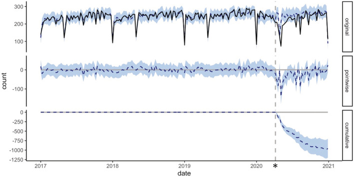
FIGURE 3.

The causal impact model of the number of performed endoscopic examinations. The vertical dashed line represents the time in April 2020, when the state of emergency was declared. The graph in the upper “original” row shows the actual number of tests per week (solid line) and the number of tests estimated by the model (dashed line). The graph in the middle row shows the difference between the number of tests estimated by the model and the actual number of tests. The bottom row shows the change in the total number of tests since the event; the 95% confidence interval is shown in blue
