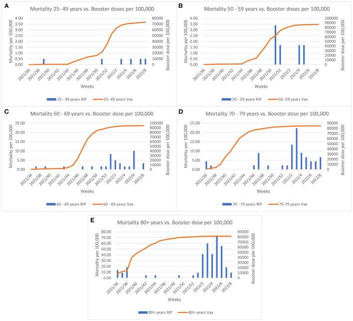
Figure 3.
Comparisons between morality rate and the booster dose coverage per 100,000 across age groups and weeks since initiation of the booster rollout. Left y-axis Graph (A,B) scale represents mortality up till 4 per 100,000; Graph (C,D) scale represents mortality up till 25 per 100,000 and Graph (E) represents mortality up till 80 per 100,000.

