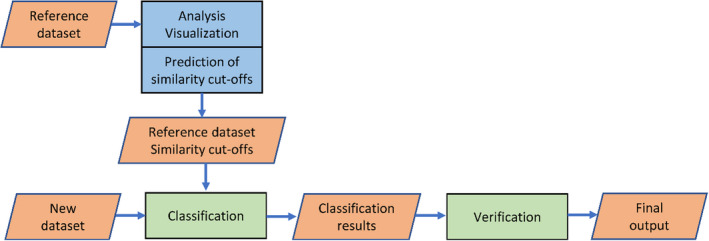
FIGURE 1.

Flow chart of dnabarcoder. The rectangles in blue and green represent the components of dnabarcoder while the parallelograms in orange represent the input and output of those components. The components in blue analyse and predict local similarity cutoffs for a reference data set. The components in green classify a new data set against the reference data set with the predicted similarity cutoffs and verify the results
