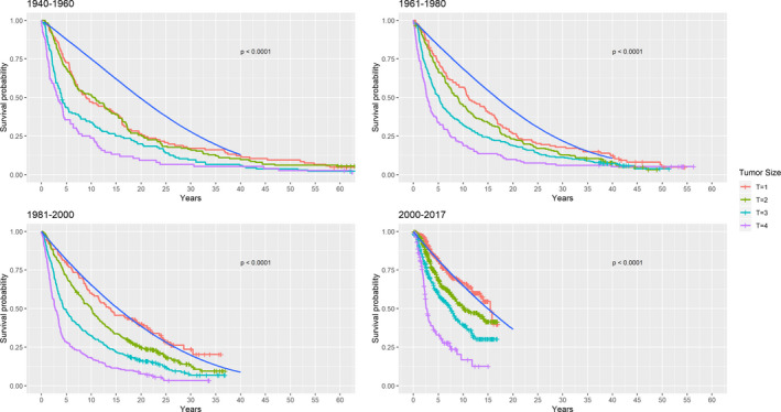
Fig. 6.

Relative survival categorized by calendar periods. The coloured lines represent all‐cause mortality of the study population according to AJCC tumour sizes. The blue solid line depicts survival probability in the Danish background population conditioned on identical distribution of age, sex and birth year. The distance between the coloured lines and the blue line represents excess mortality which can be interpreted as the disease specific mortality. T = AJCC tumour size.
