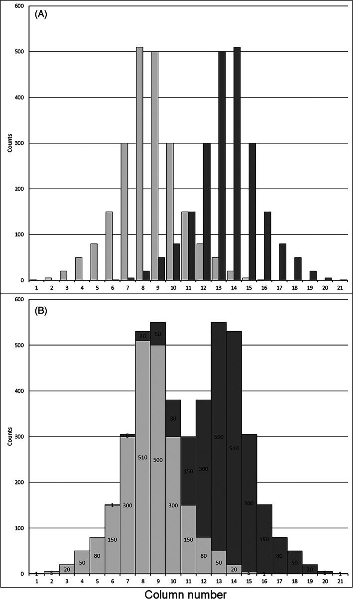
FIGURE 3.

Illustration of minimum peak distance based on a fictitious data set. (A) Two visually superimposed, but independent individual peak histograms (light gray and dark gray). Columns 8 and 14 represent the modes of the light gray and dark gray peak, respectively; (B) the combined data set shows the “additive spill over.” Each column content mutually contributes to a column's content of the other peak. This resembles the situation of measurements, when nuclei with similar mean fluorescence intensity produce “overlapping” peaks in the histogram. For the left‐hand peak, the dark part on top of each column is the contribution of the right‐hand peak (dark gray). Since this contribution increases toward the right, the left mode is shifted to the middle between the two peaks. The modes of the two peaks approached and are now represented by the Columns 9 and 13, respectively
