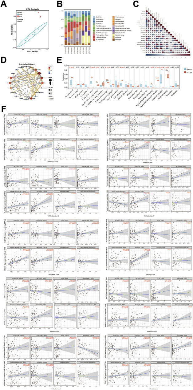
FIGURE 7.

Immune cell infiltration status in SKCM. (A) PCA cluster plot of immune cell infiltration between melanoma cell lines and health controls. (B) Histogram showed the composition of 22 kinds of immune cells in both samples. (C) Correlation heat map of 22 types of immune cells. The size of the colored squares represents the strength of the correlation; blue represents negative correlation, red represents a positive correlation. “×” represents p value > 0.05. (D) Correlation network map showed a connected network with immune cells. p value < 0.05, and Rho ≥ 0.5 or Rho ≤ −0.5 were showed in the network map. (E) Box diagram of the infiltration of immune cells between the two groups of samples. *p < 0.05; **p < 0.01; ***p < 0.001. (F) Correlation between different expressed hub genes and immune cell infiltration in TIMER.
