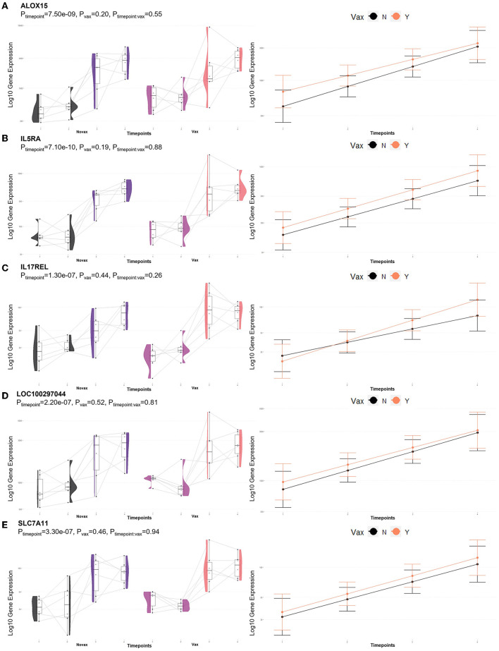
Figure 5.
Gene pairplots and modeled expression trends of key DEGs found in timepoint analyses. Pairplots (left side) demonstrate the log10 normalized gene expression of each sample across all timepoints, overlapped with a violin plot (depicting numerical distributions by density). Box-and-whisker plots represent median expression values (black line), the first (lower) and third quartiles (boxplot limits), 1.5 times the interquartile ranges (whiskers), and outlier expression levels for each timepoint (points outside whiskers). Modeled expression trends (right side) depict the overall differences between groups over each timepoint. Points represent the mean log10 normalized expression value for each group within a timepoint, and bars represent the standard error of log10 normalized expression for each group; orange represents the vaccinated group and black represents the non-vaccinated group. These plots depict the relative expression and glmmSeq level of significance for (A) ALOX15, (B) IL5RA, (C) IL17REL, (D) LOC100297044 (CCL14), and (E) SLC7A11.

