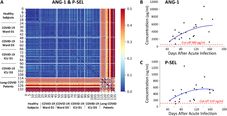
Fig. 2.
Similar biomarker profiles and plasma concentrations relative to days after acute infection. A A heatmap demonstrated the pairwise Euclidian Distance between cohort’s biomarker profiles with respect to ANG-1 and P-SEL. Lower distances between patients indicate similar biomarker profiles while larger distances indicate large differences between profiles (distance was pseudocolored on the bar scale). The biomarker profile of Long-COVID outpatients is distinctively different from all other cohorts. The heatmap color scale was capped at 0.5 to restrict interpretation bias from Long-COVID outliers (max value 1.2) and allow for more visible details. B A plot demonstrated ANG-1 concentration versus time after acute infection. A cut-off value, adopted from previous ROC analyses on multiplex data, and a best fit polynomial regression line were calculated. C A plot demonstrated P-SEL concentration versus time after acute infection. A cut-off value, adopted from previous ROC analyses on multiplex data, and a best fit polynomial regression line were calculated

