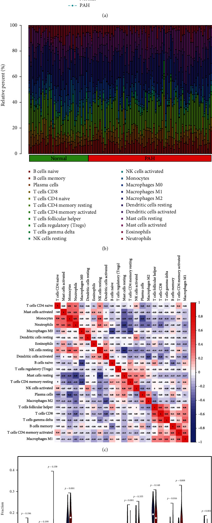
Figure 10.

Comparing the composition of immune cell infiltration in the normal and PAH samples by using the combined data matrix of GSE113439 and GSE117261 and visualized the results. (a) PCA cluster plot of immune cell infiltration between normal and PAH samples. (b) The heat map of the 22 subpopulations of immune cells. (c) Correlation heat map of 22 types of immune cells. The size of the colored squares represents the strength of the correlation: red represents a positive correlation; blue represents a negative correlation. The redder the color, the stronger the correlation. (d) Violin diagram of the proportion of 22 types of immune cells. (The normal samples are marked as blue color and PAH samples marked as red color. P values <0.05 were considered as statistically significant.) PAH: pulmonary arterial hypertension; PCA: principal component analysis.
