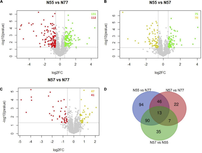
FIGURE 2.
Volcano plots and Venn diagram of protein abundance differences between conditions. (A–C) Volcano plots of the proteins differentially abundant between each pair of experimental conditions (FC > 1.5, p-value < 0.05). Spots representing proteins with increased abundances in N55, N57 and N77 are coloured in red, yellow and green, respectively. (A) N55 vs N77; (B) N55 vs N57; and (C) N57 vs N77. (D) Venn diagram showing the number of proteins that are differentially abundant in the several comparisons of experimental conditions (N55 vs N77, N55 vs N57 and N57 vs N77).

