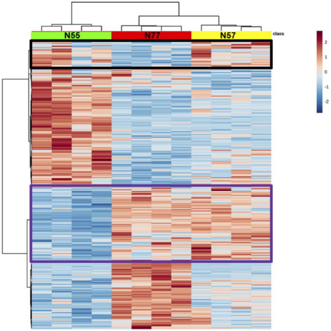
FIGURE 3.
Hierarchical clustering of differentially abundant proteins. In green, red and yellow are identified the columns for the replicates of each experimental condition, respectively N55, N77, and N57. In the heatmap, red and blue correspond to higher and lower abundant proteins, respectively. The tree in the x axis represents the similarity among experimental conditions regarding abundance of proteins and in the y axis the proteome similarities. Proteins having increased levels in common between conditions N55 and N57 and conditions N57 and N77 are evidenced in black and purple rectangles, respectively.

