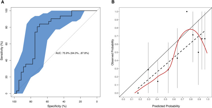
Fig 2. Performance characteristics of the prediction model.
Discrimination (A) and calibration (B) plots of the Ebola Virus Disease Prognosis in Children (EPiC) model are shown for the Democratic Republic of the Congo validation dataset. In the discrimination plot, the receiver operating characteristic (ROC) curve is plotted (central black line) together with the 95% confidence interval band (blue shaded area). In the calibration plot, the dots represent the mean estimate of the observed probability for each 10% bin of predicted probability (with probability being risk of death), the vertical lines passing through each dot are the corresponding confidence intervals for the observed probability, the dashed line is the best linear fit passing through the mean values, and the red line is the LOESS curve fitting all the individual observed/predicted pairs in the data.

