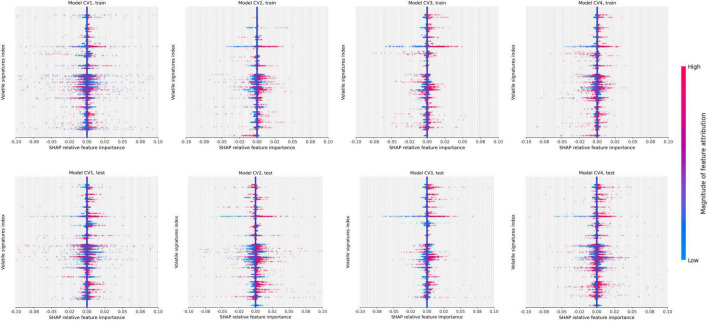
FIGURE 6.
Beeswarm summary plots on train and test data. This plot combines feature importance and feature effects. Every feature (VOC) is represented as a row on the y-axis (3,400 total) and SHAP values are on the x-axis (multiple VOC may overlap at a single index). Each dot represents a Shapley value for a given sample prediction. The color intensity shows the magnitude of importance of each feature.

