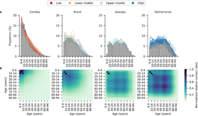
Figure 1: Demography of simulated countries.
(a) Bar plot shows the age distribution of each simulated country archetype (Low and middle-income countries (LMICs): Brazil, Georgia, Zambia; High-income country: Netherlands) stratified in 5-year bins. Each dashed black line in the Brazil, Georgia and Zambia plots denotes the age distribution of one of 132 other LMICs14 that best matches (i.e. lowest mean absolute error) the age distribution of the simulated country archetype. Age distribution of the population in each country is downloaded from World Population Prospects compiled by the United Nations15. (b) Heatmap showing the normalized relative contact rates between individuals of different age groups in 5-year bins averaged across all contact networks generated by the PATAT simulation model.

