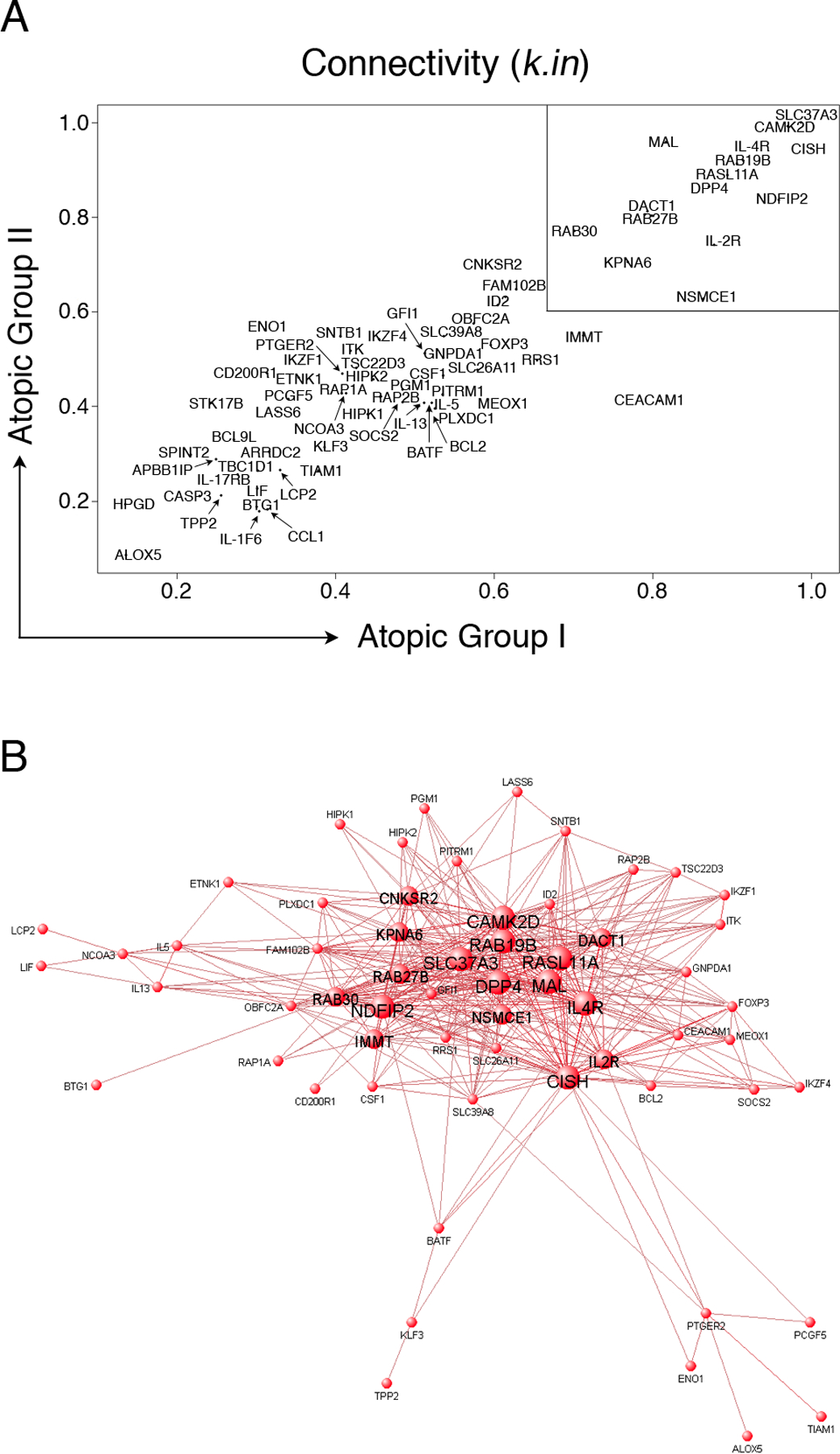
Figure 3: Visualization of the atopy-associated module and identification of putative hubs.

(A): Network analysis was performed separately on the two independent atopic CD4+ Th-cell response microarray data sets and variations in the patterns of connectivity within the atopy module were investigated by calculating the k.in (see methods). Hyper-connected hub genes have a k.in approaching 1.0, and are therefore located in the upper right region of the scatter diagram (box). The k.in values were highly correlated across the two independent data sets (Spearman rho = 0.84, p-value < 1 × 10⁻¹⁵).
(B): A graphical representation of the atopy-associated module. The microarray data from the two independent atopic data sets was pooled and network analysis was performed. The top gene-gene interaction data (i.e. all pairwise connection strengths > 0.25; corresponding to the top ~ 500 interactions) within the module were submitted to VisANT software (http://visant.bu.edu/) for network visualization. To illustrate the hubs, progressively larger font and node sizes were selected based on the connectivity data, which was partitioned into four categorical bins of > 31 links, 21 – 30 links, 11 – 20 links, and < 10 links. The hubs appear as the large central nodes in the network diagram.
