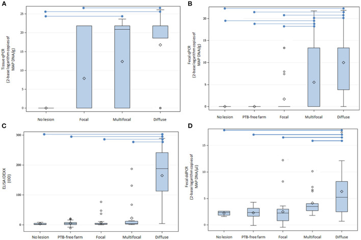
Figure 1.
Tissue qPCR, fecal qPCR, ELISA, and fecal ddPCR results. (A) Distribution of tissue qPCR results (log2 copies of MAP DNA/gr). (B) Boxplot showing the log2 copies of MAP DNA/gr of feces obtained by fecal qPCR. (C) Distribution of the ELISA OD results. (D) Distribution of log2 copies of MAP DNA/μl estimated by fecal ddPCR. The plots represent the interquartile range and the whiskers represent the 95% range. Lines and diamonds within the boxes represent the median and the mean of each group, respectively. Blank dots represent outliers. Blue lines on the top of the figures represent statistically significant differences (P ≤ 0.05).

