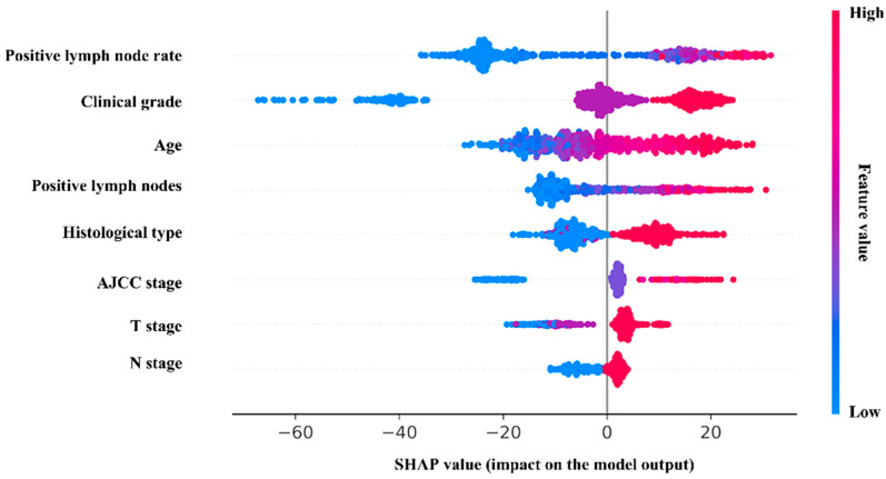
Figure 4.
The SHAP plot of the RSF model. In the SHAP plot, the length of the horizontal axis where each variable is located represents the variable’s contribution to the outcome. The color of the dot symbolized the numerical value of the variable. For example, the variable (positive lymph node rate) is the most significant risk factor. The higher the rate is, the higher the probability of poor prognosis is.

