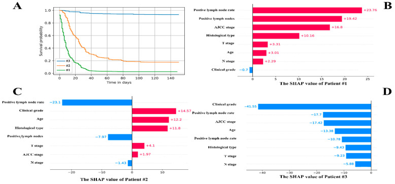
Figure 6.
The individual postoperative prognostic prediction. (A). The estimated survival function of patients. The green line symbolizes the patients A while the yellow line represents the patient B. The blue line on behalf of the patient C. (B). The local SHAP plot of the patient #1. (C). The local SHAP plot of the patient #2. (D). The local SHAP plot of the patient #3. The red ribbon in the local SHAP plot represented the risk factors, which promoted the poor prognosis, whereas the blue ribbon was the relatively protective factors.

